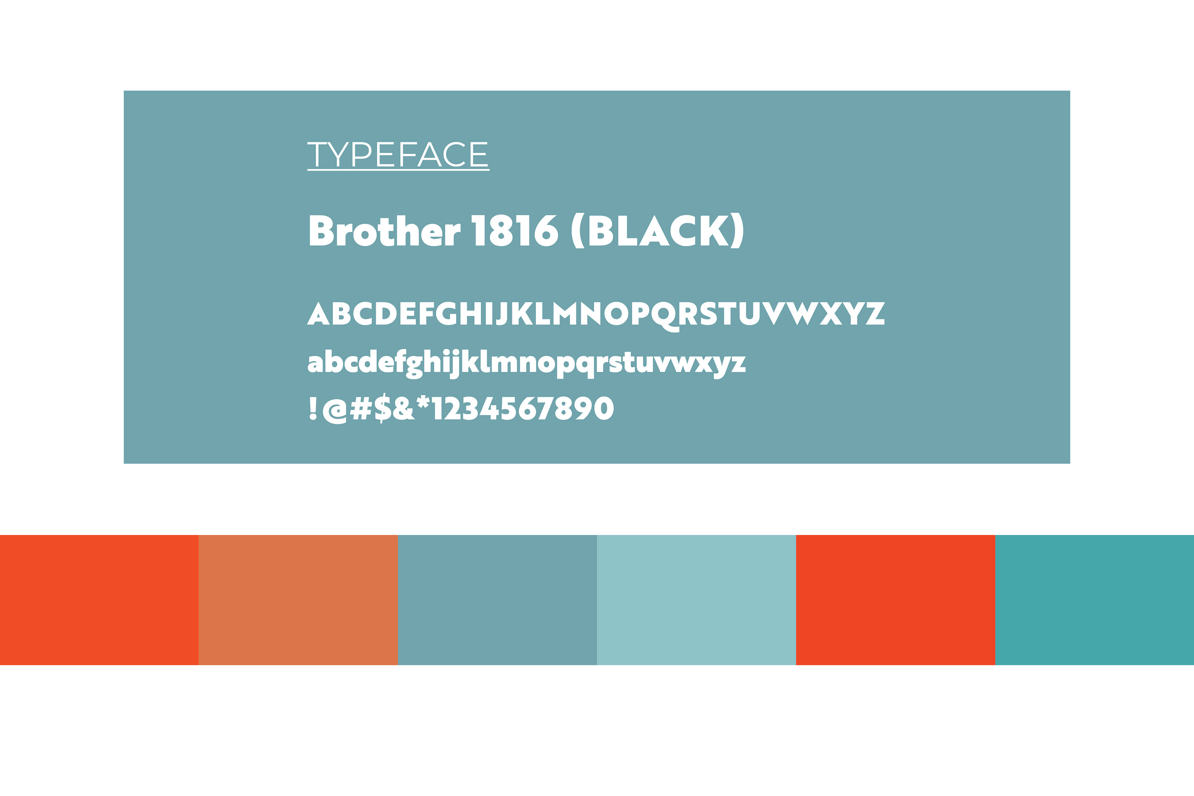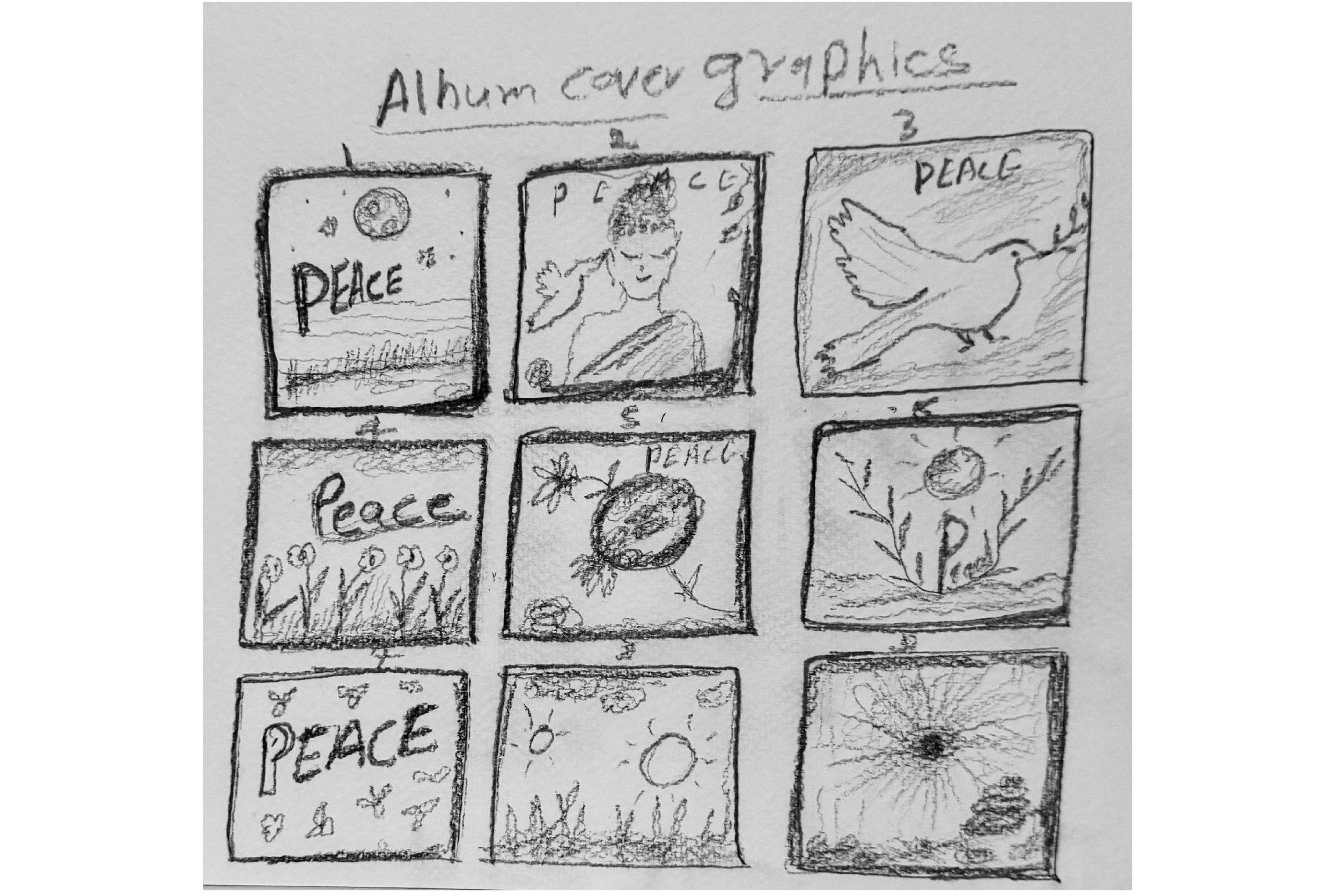
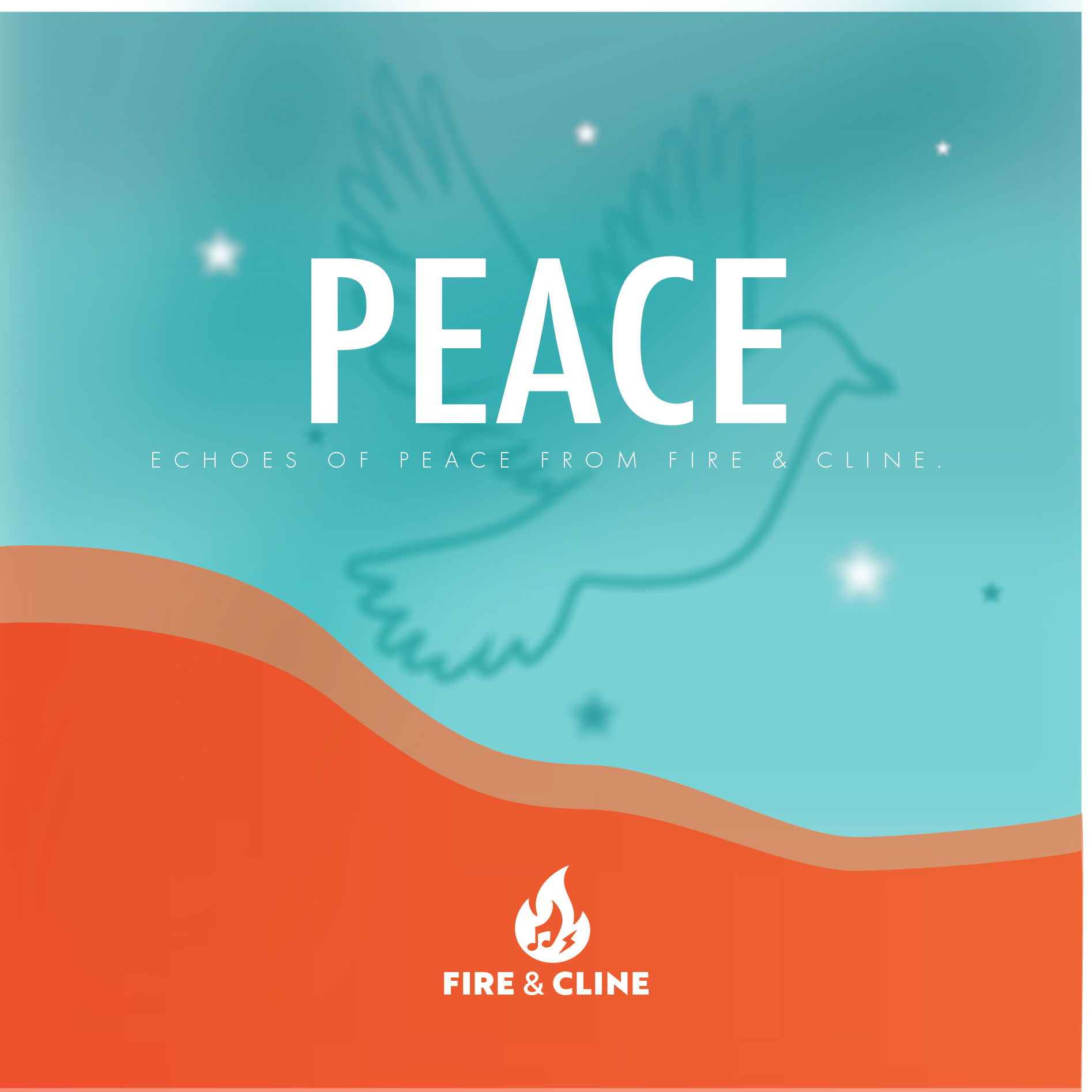
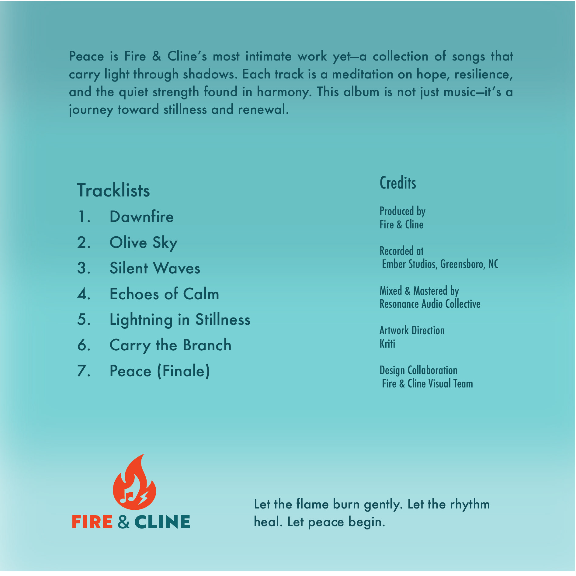
Fire and Cline is a project where I explored how a music brand can feel peaceful yet full of emotion. While sketching ideas, I kept returning to calming symbols like doves and flowers, which helped me see “Fire” as warmth rather than intensity. I built the identity with soft blues for peace and touches of orange for creative energy, keeping the designs clean across the album cover, poster, merchandise, and digital layouts. Finding the balance between calm and passion was the main challenge, but color choices and simple forms helped everything connect. This project taught me how mood and meaning can shape a brand’s entire visual direction beautifully and intentionally. This project became special to me, and I selected colors that connect closely with my own brand palette.
Promotional Materials Designed in Adobe Illustrator


Mockups
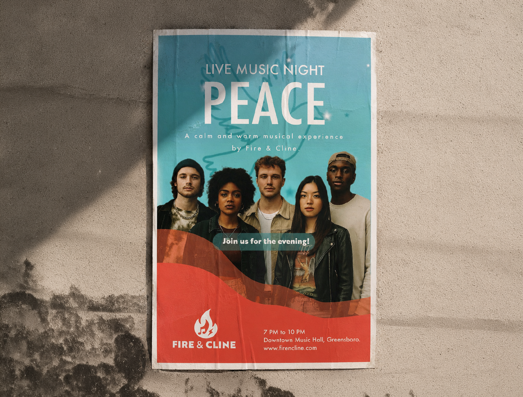
Flyer

Instagram Story

Billboard
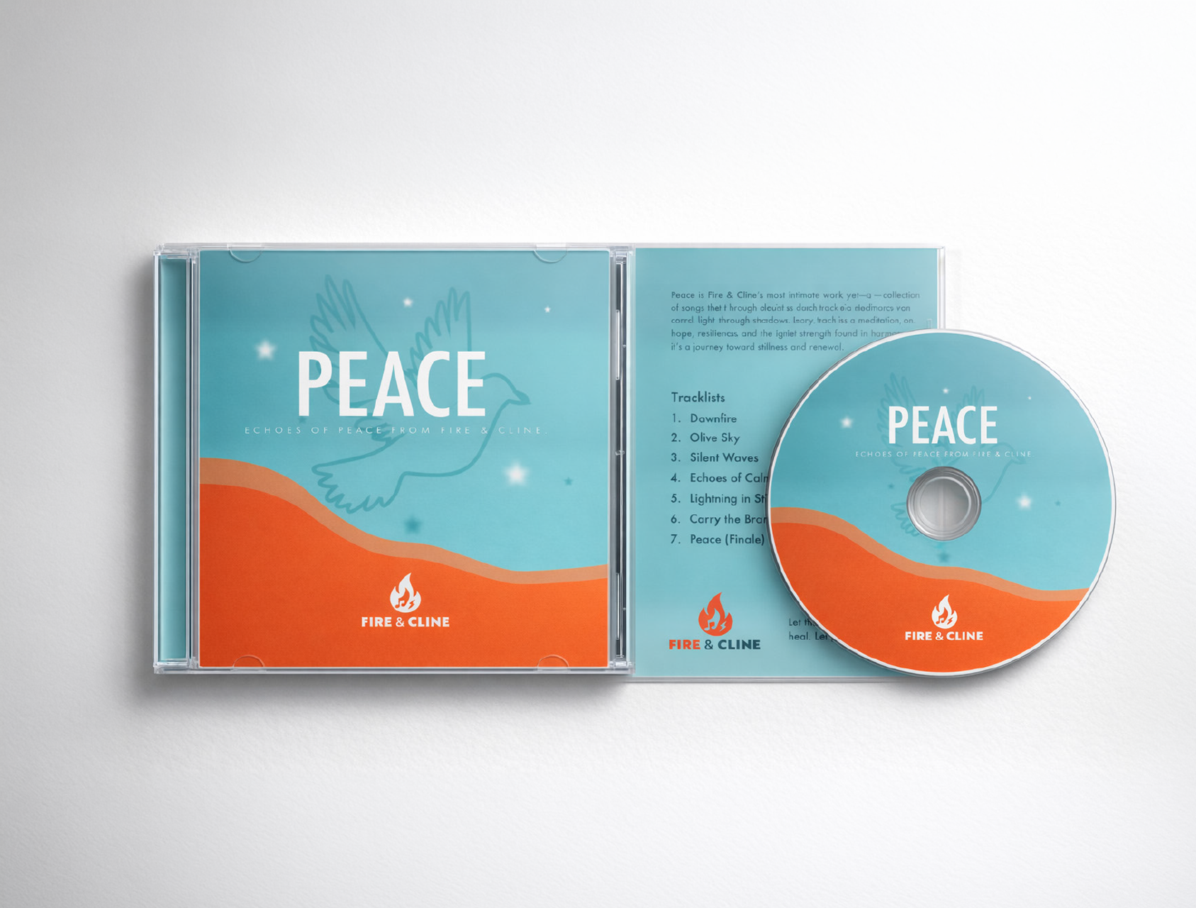
Album
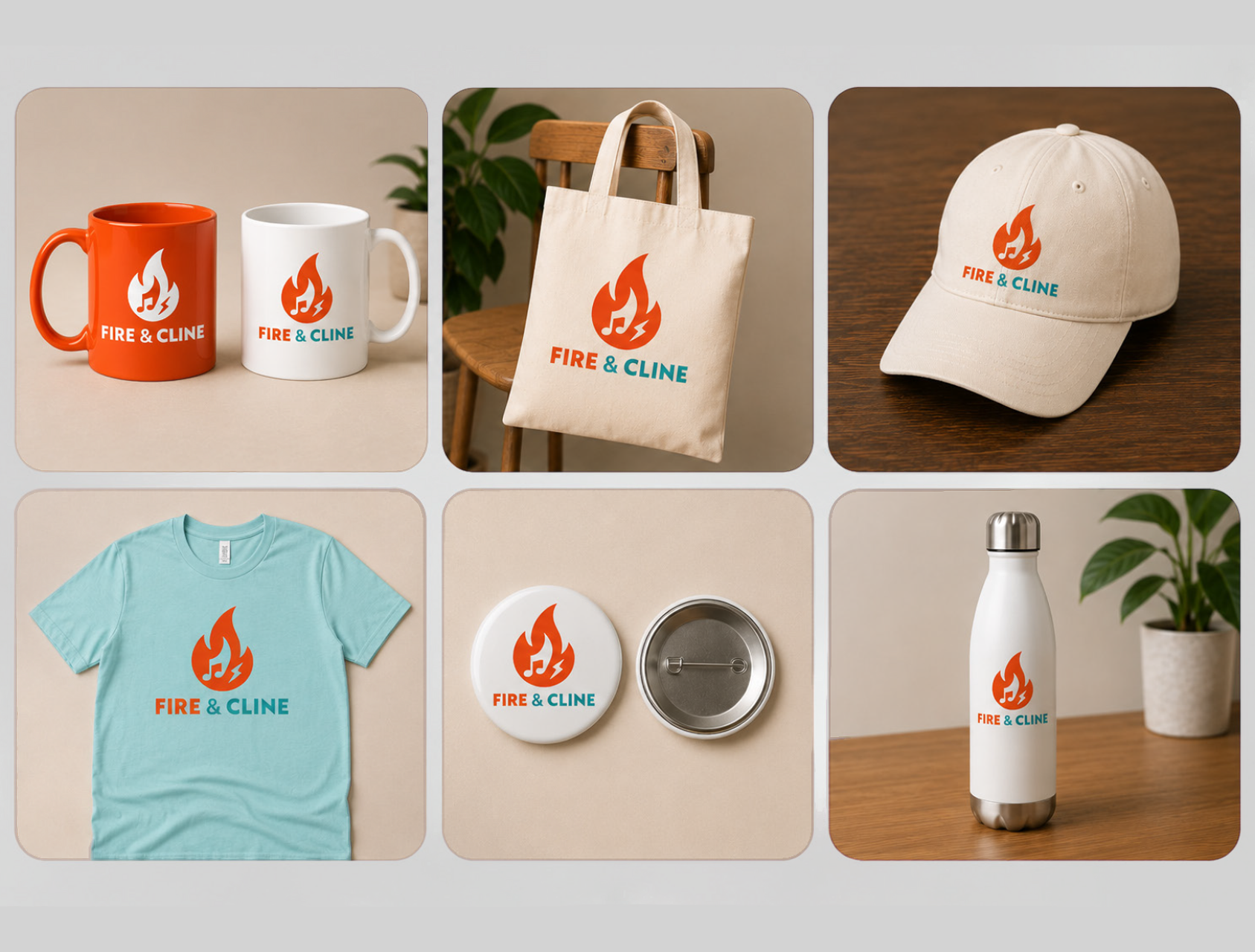
Merch
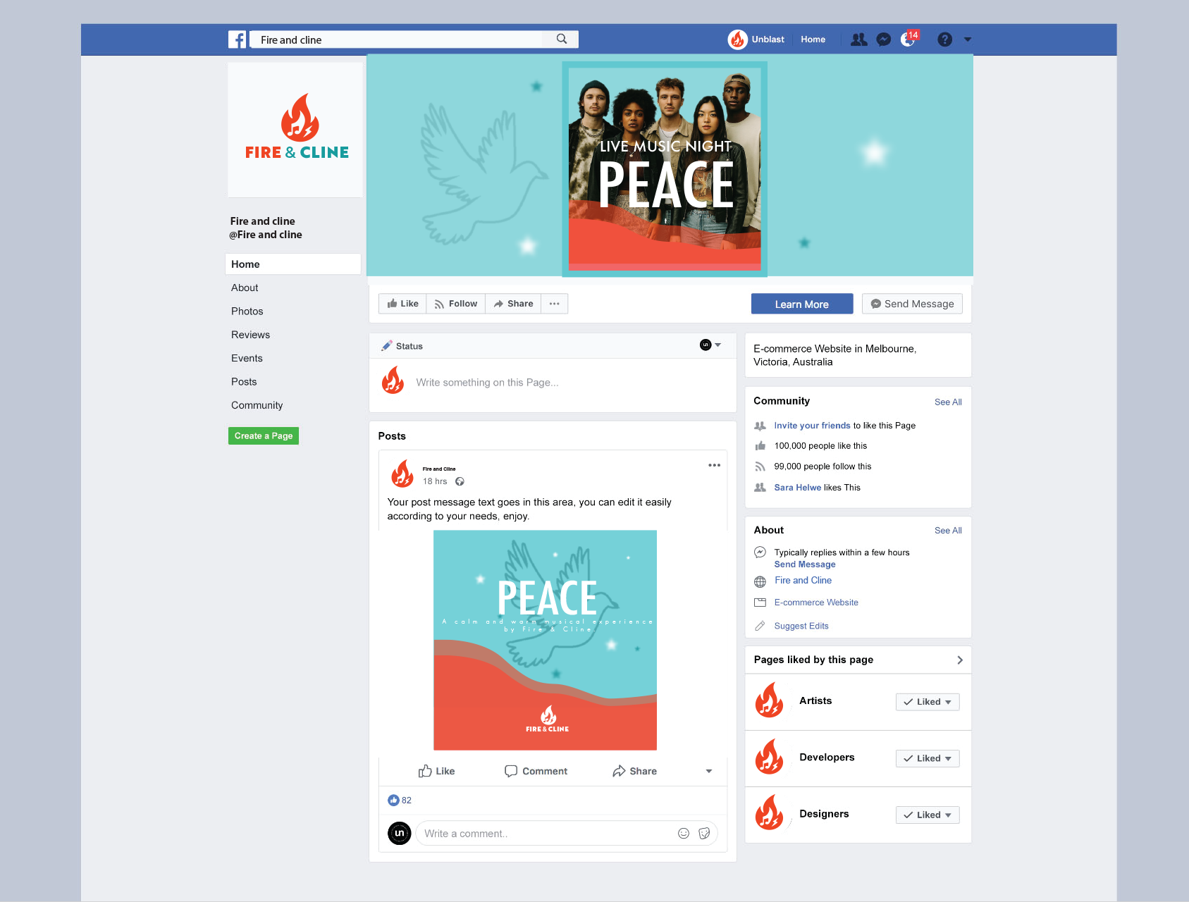
Facebook Post
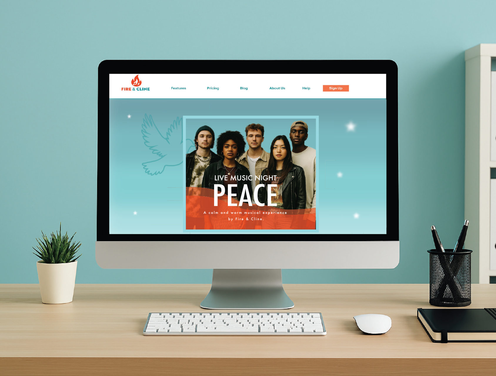
Website Homepage
Color Choices and Thumbnails