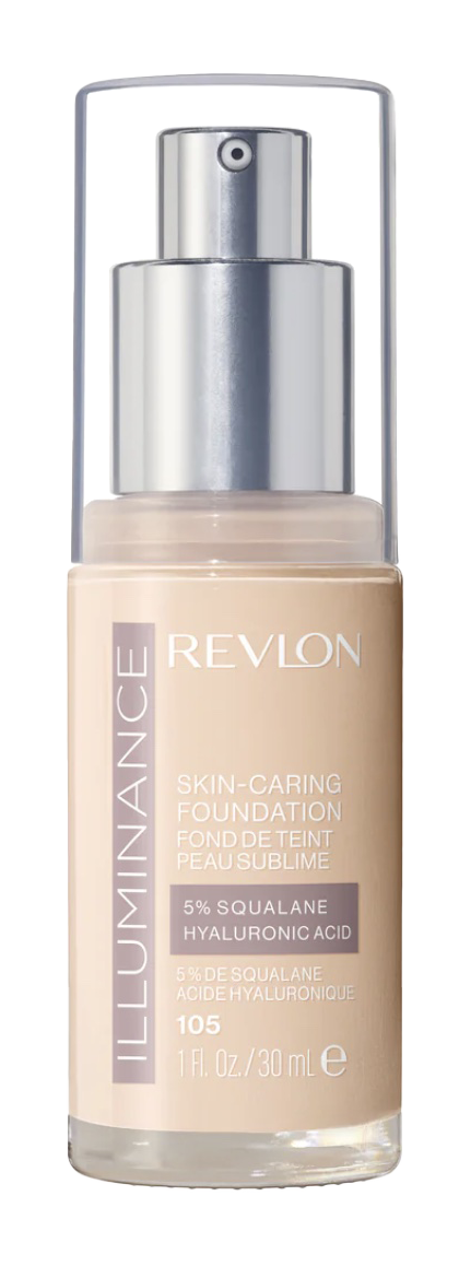
This catalogue project was a chance for me to explore how a strong beauty brand can guide a full design system from start to finish. I began with simple thumbnail sketches, trying different layouts and ideas until I found a direction that felt true to Revlon’s confident, elegant personality. From there, I built the catalogue using authentic product images, structured grids, and Revlon’s signature reds, blacks, and neutrals. Throughout the process, I focused on clarity, balance, and storytelling, making sure every page felt intentional and visually connected. The biggest lessons came from refining layouts, choosing the right imagery, and learning how brand identity shapes every design decision. In the end, the catalogue feels polished, cohesive, and aligned with real beauty marketing, while still reflecting my own creative voice.
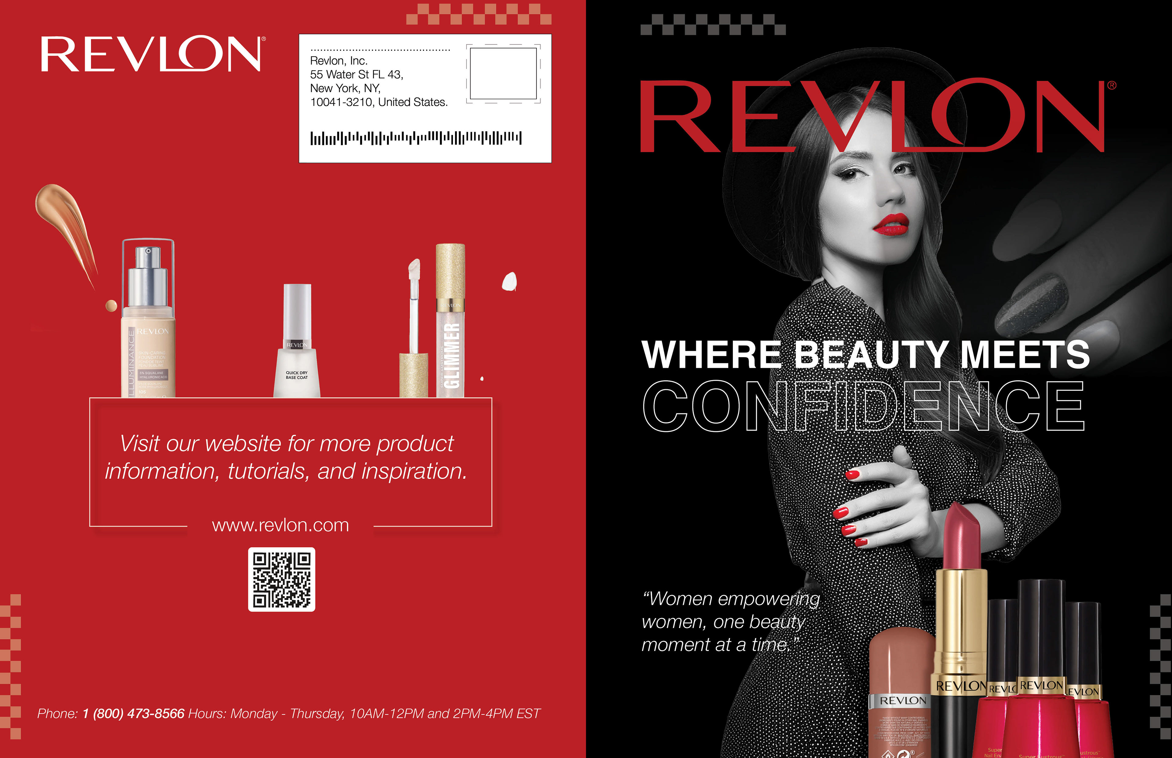
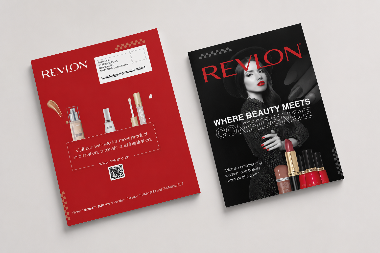
Cover Design and Mockup
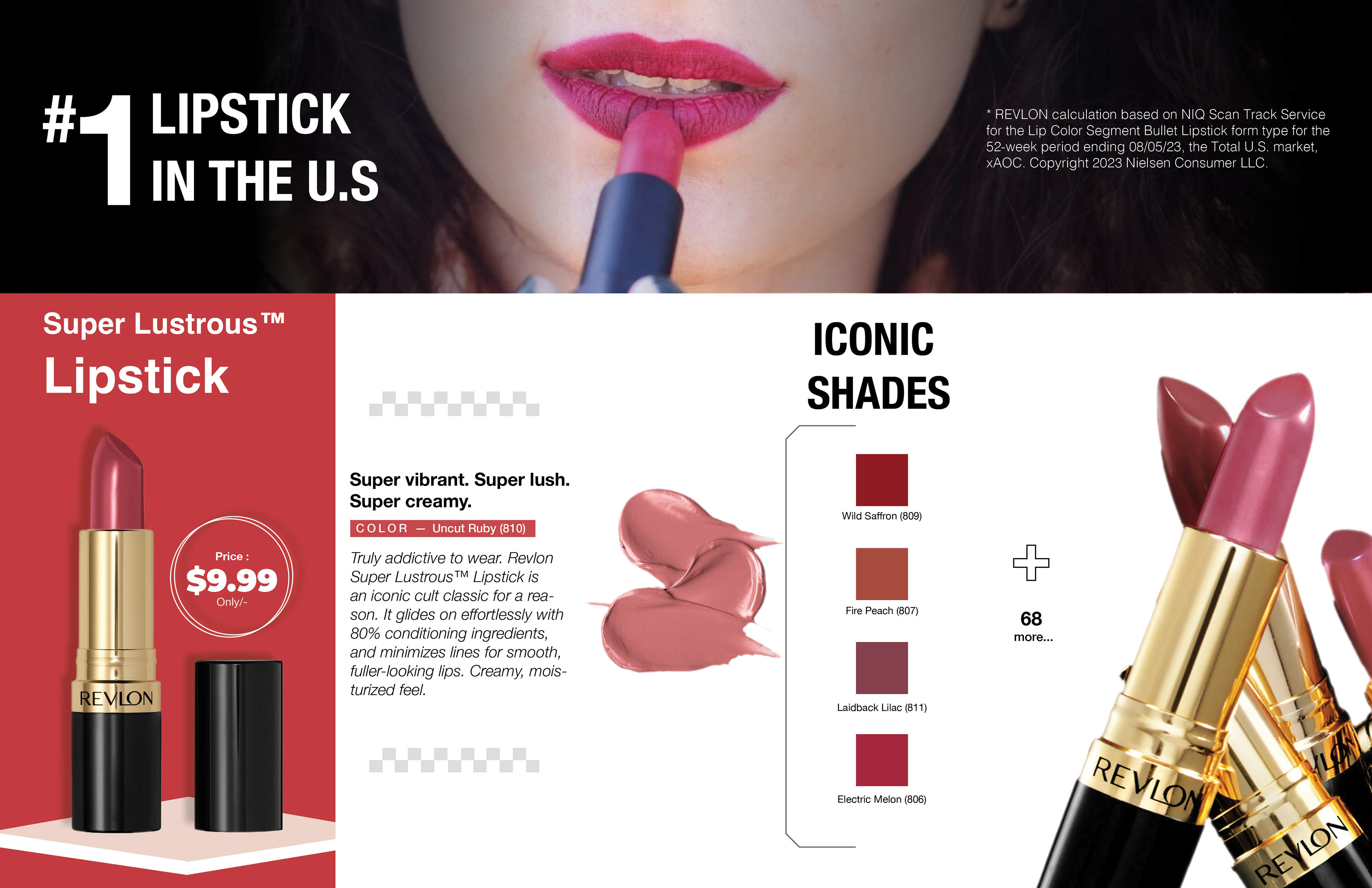
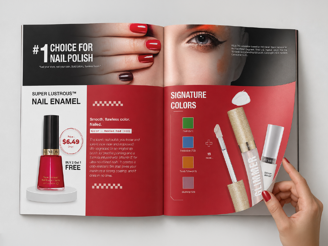
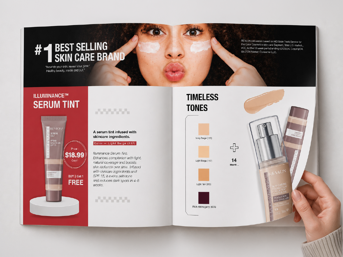
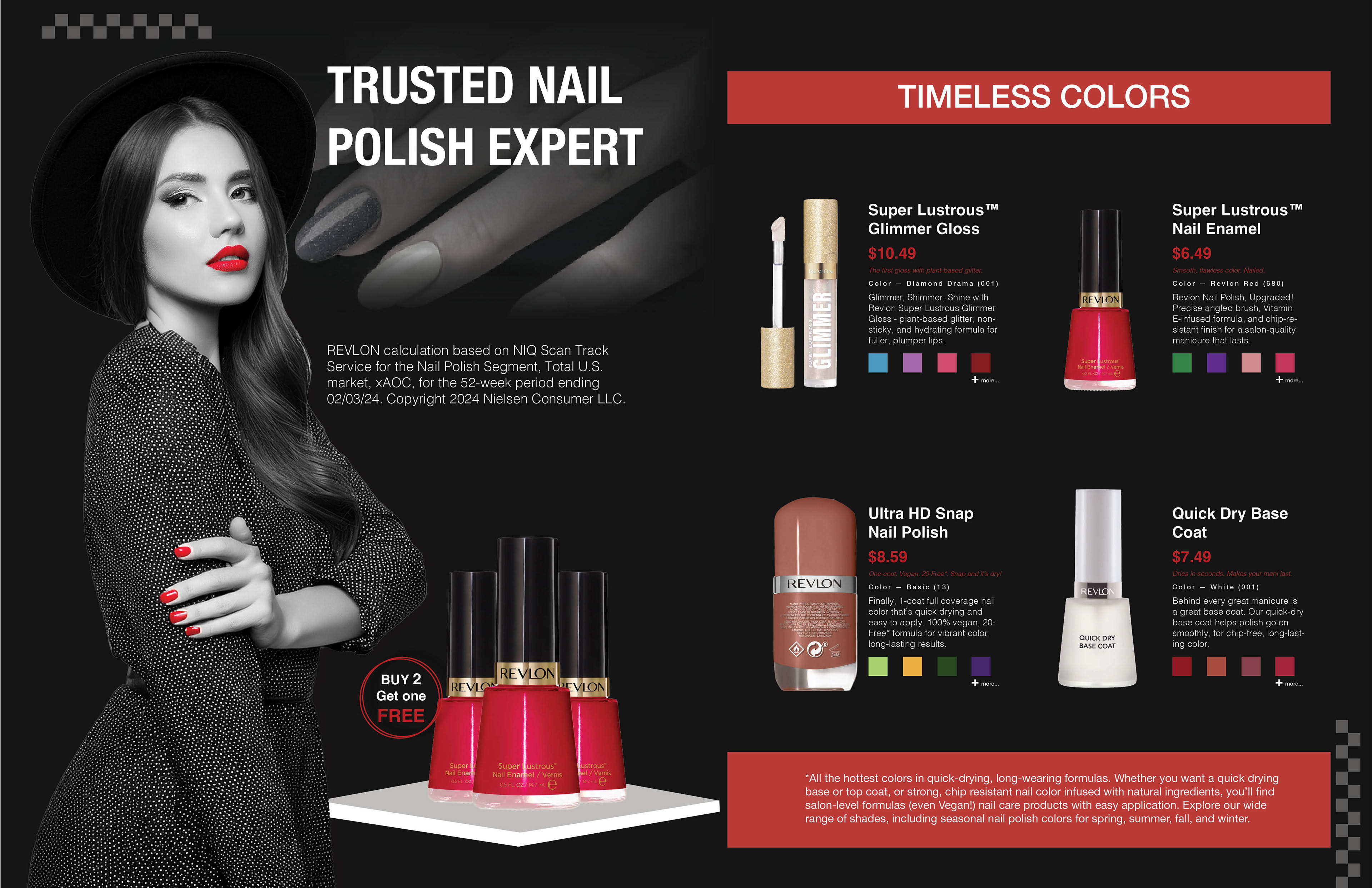
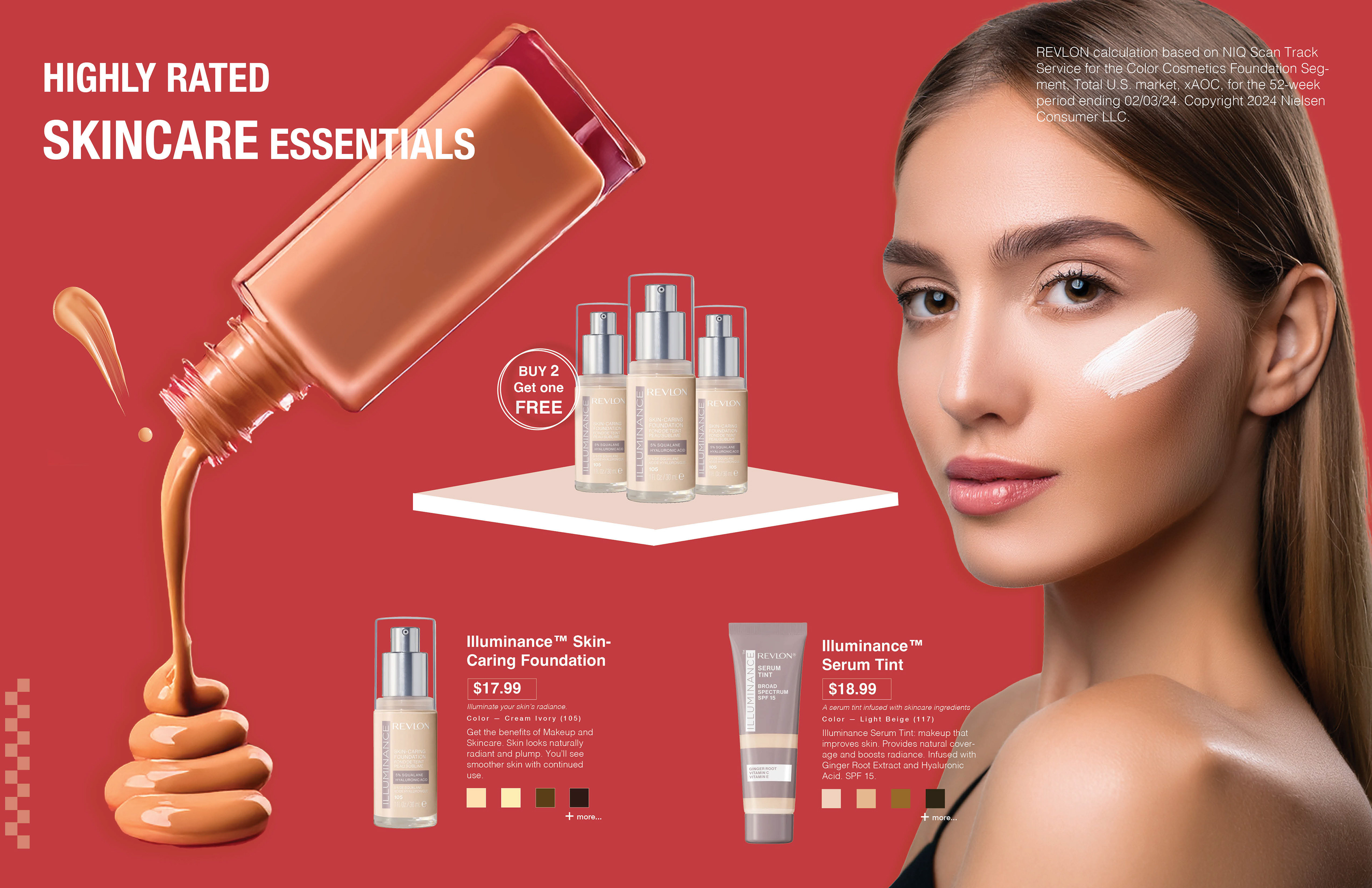
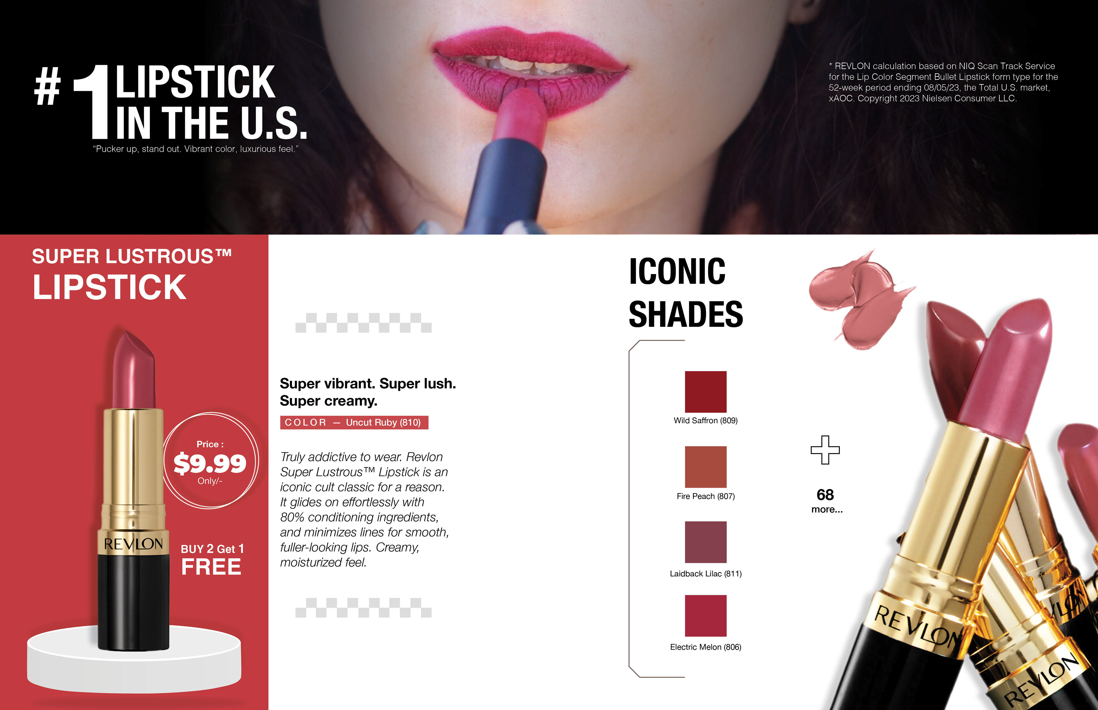
Catalog Inside pages and Mockups
Explored Three Different Digital Layouts Before Finalizing the Layout
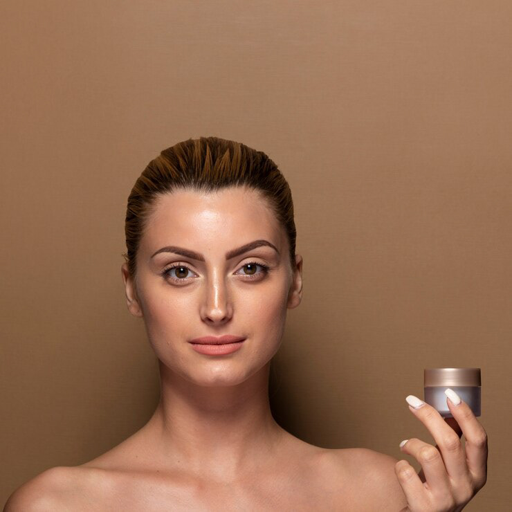
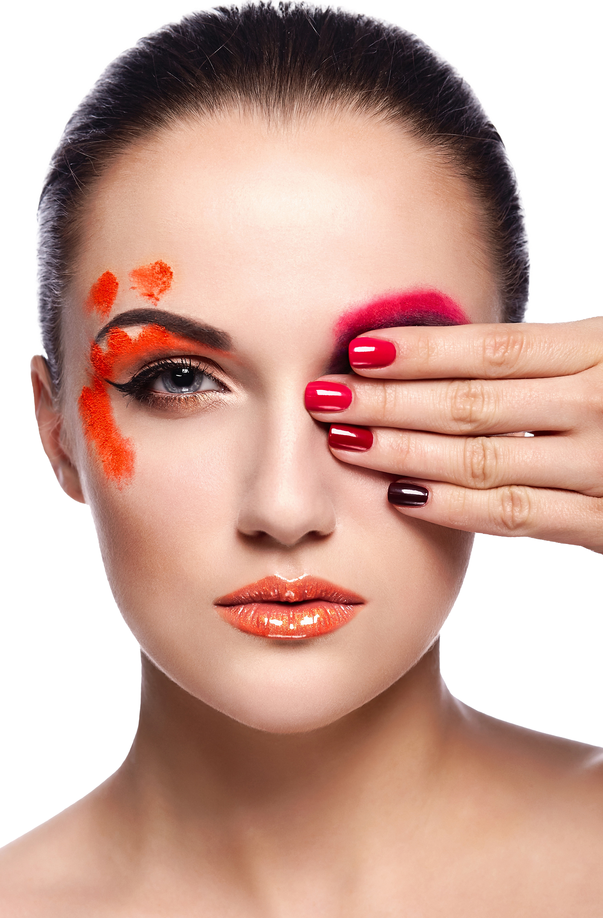
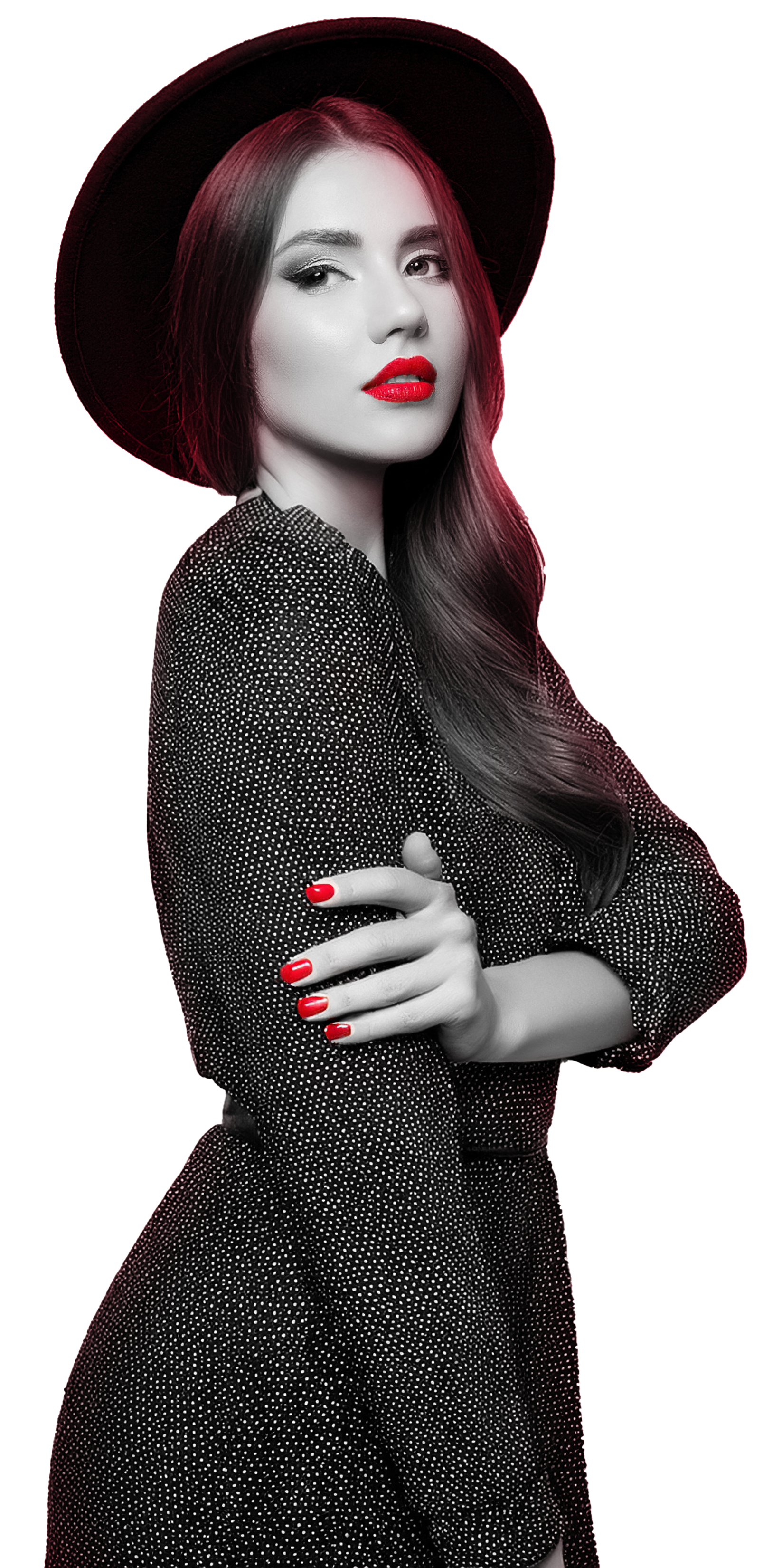
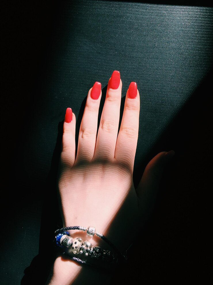
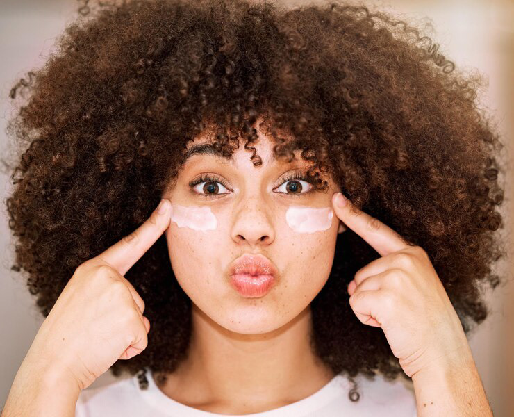
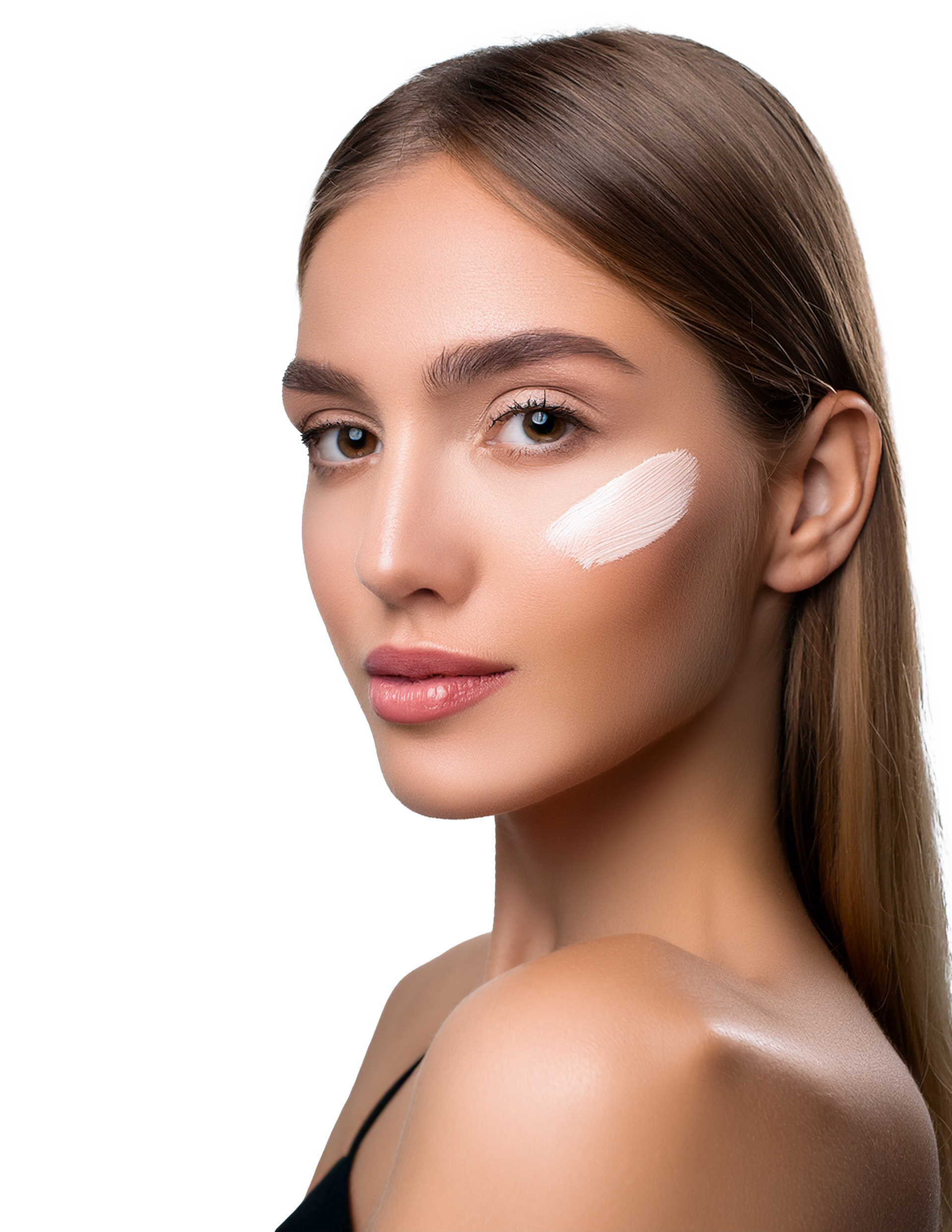
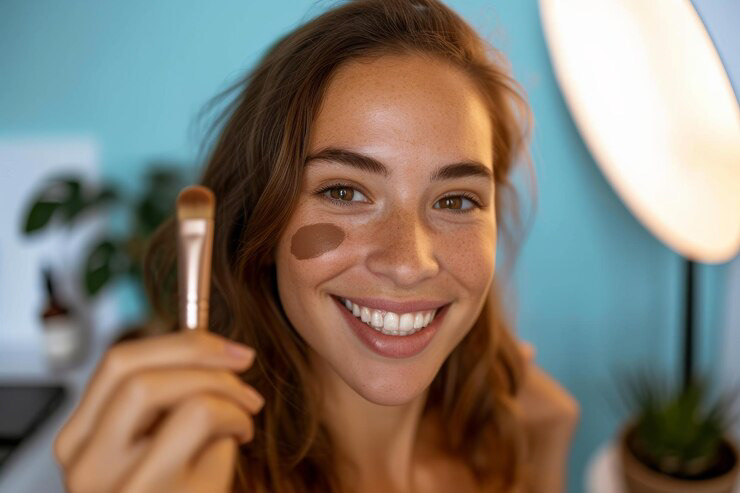
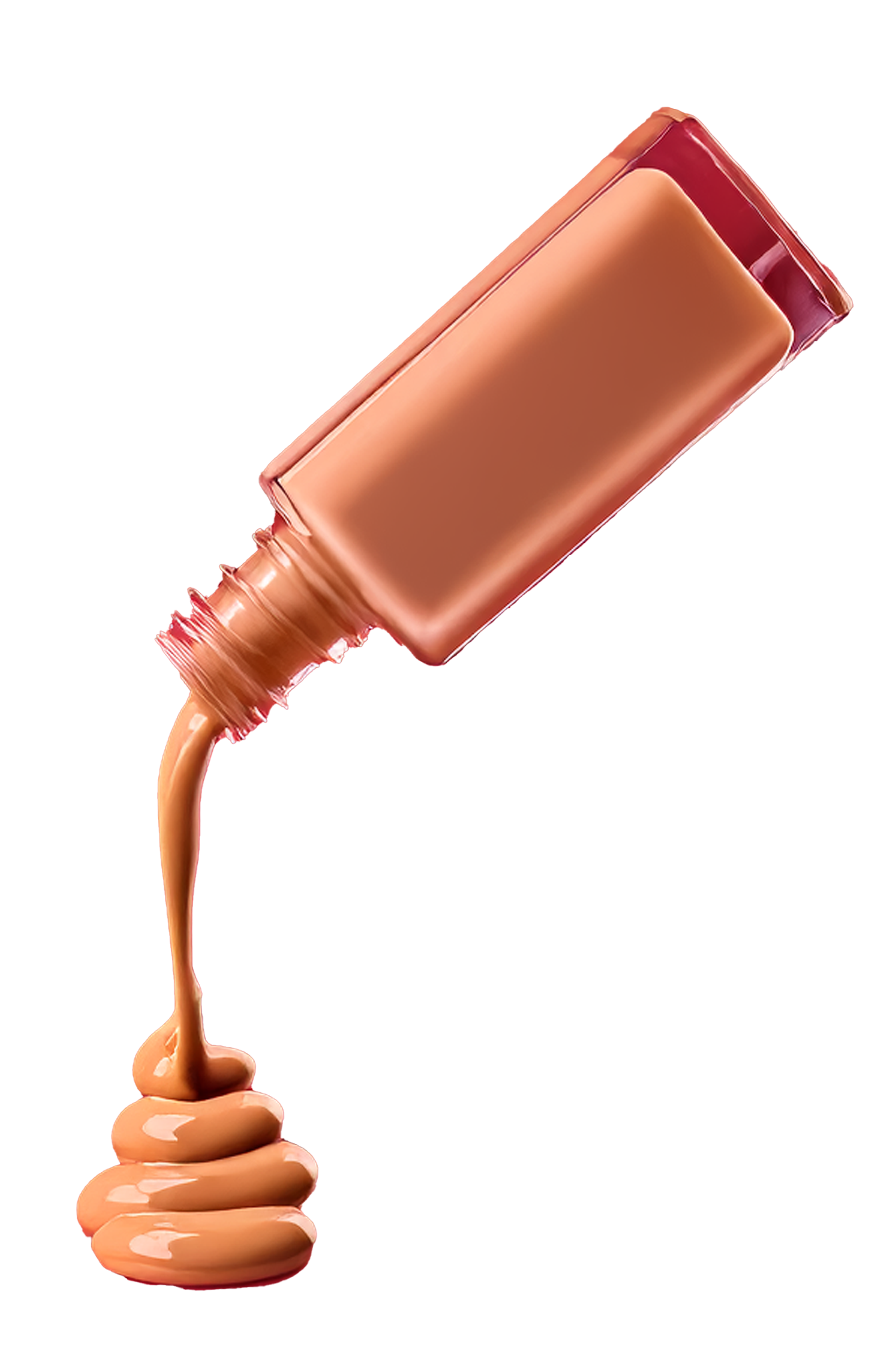
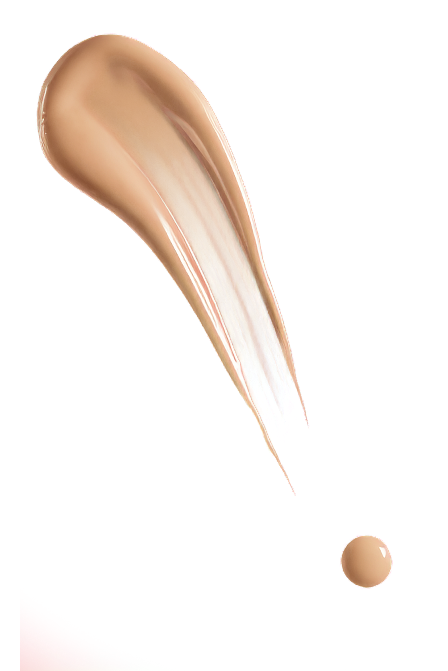
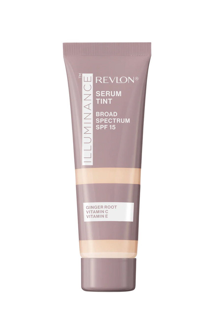
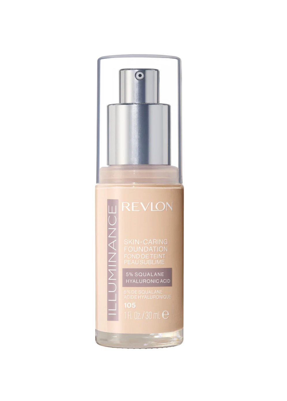
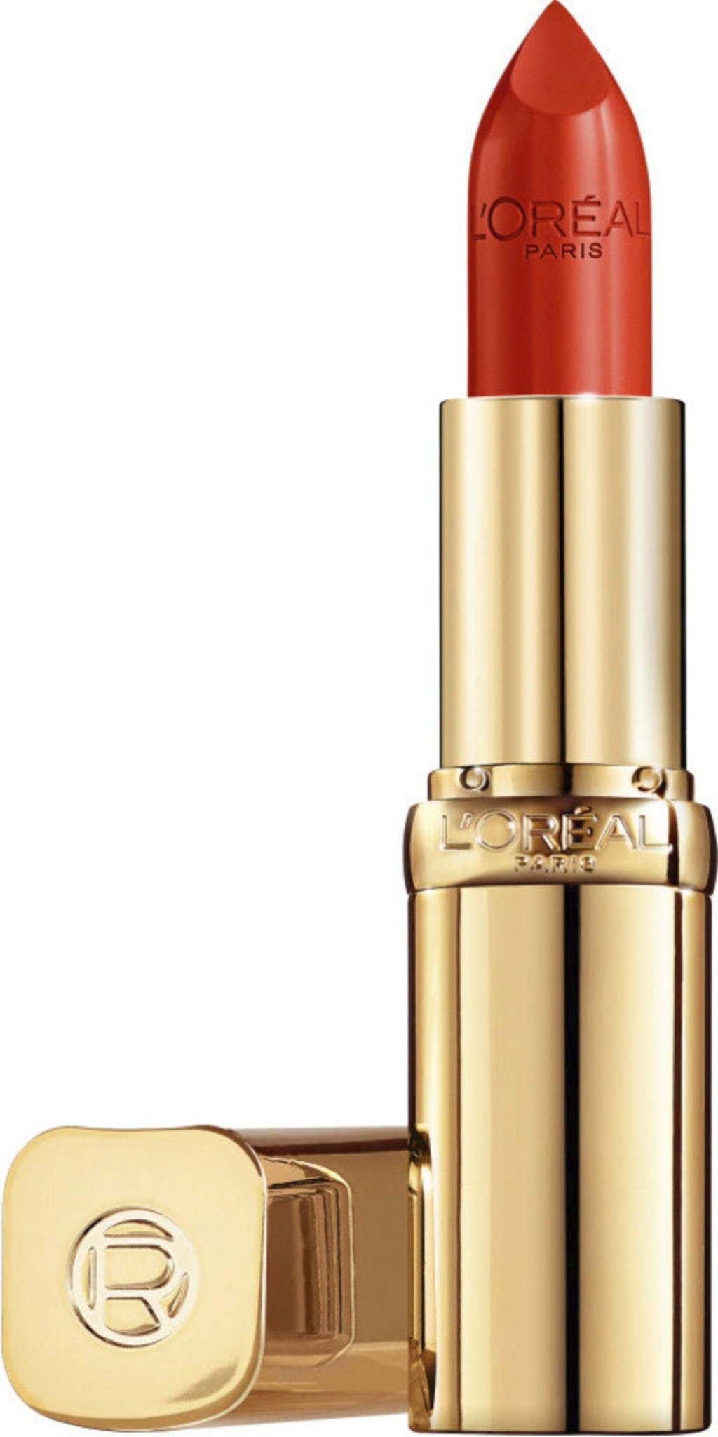
Stock Image Collections


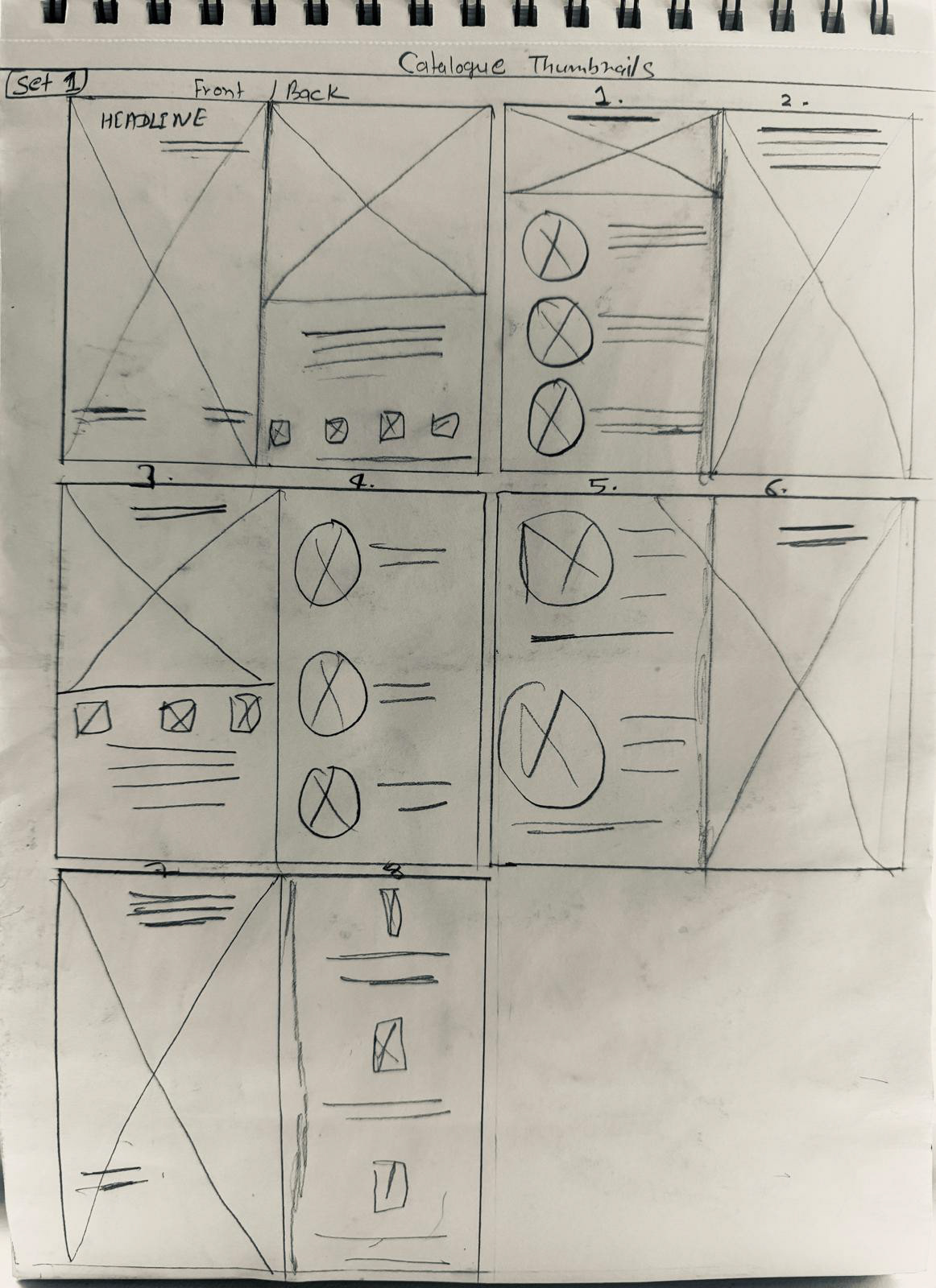
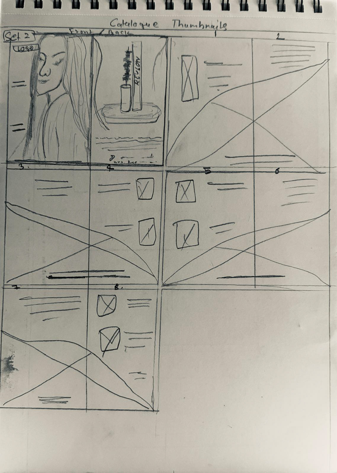
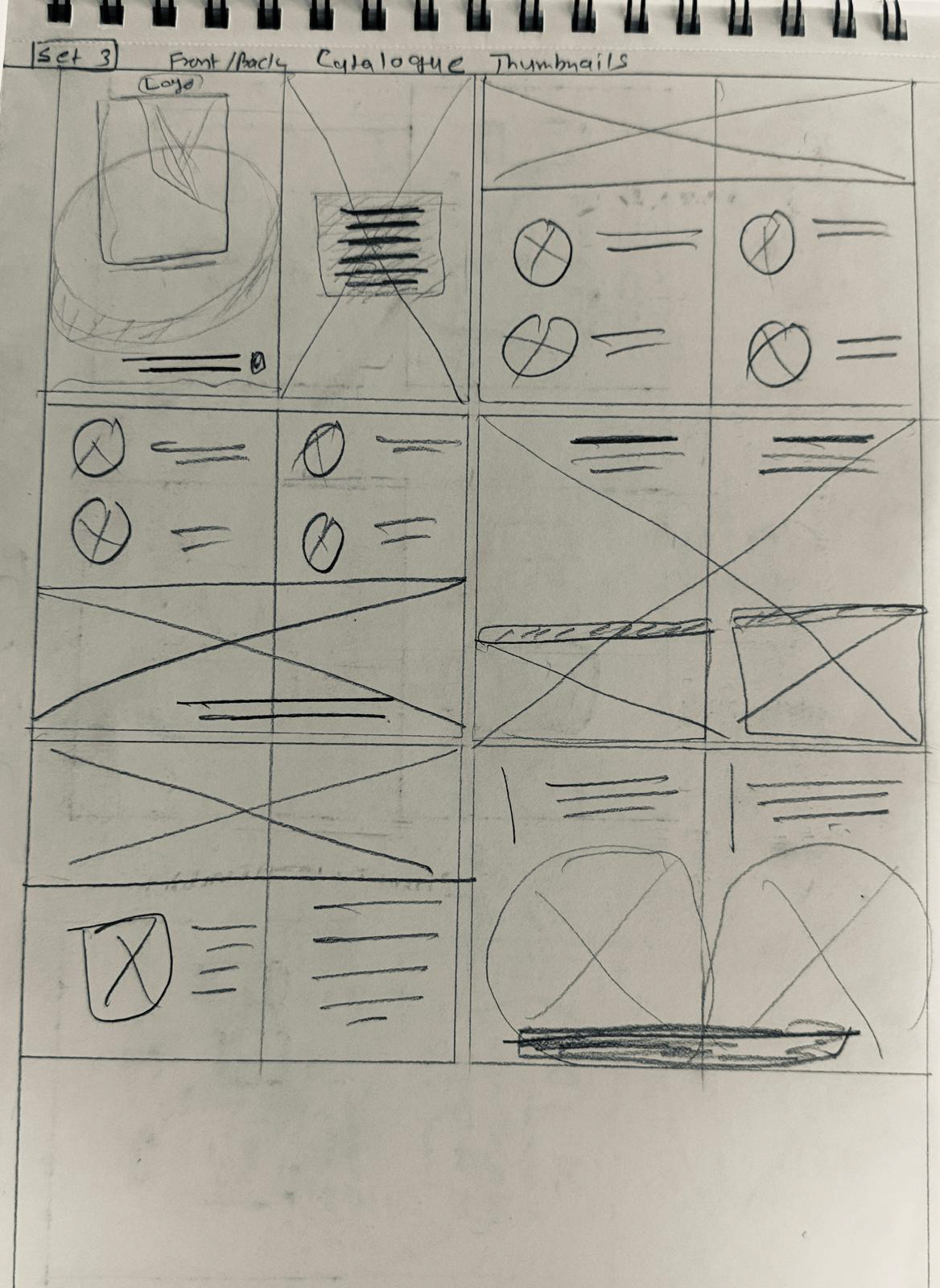
Quick Sketches for the Catalog Layout